Blow Up The Traditional Organization Chart

The traditional organization chart is as outdated as the dial-up modem. Or maybe a fax machine. You know it, I know it, everybody knows it. It's too rigid, reinforces hierarchy, and doesn't support the complexities of today's work environment. Sadly, 99.9% of companies still use it today. But here's some good news: they no longer need to.

Living in the past
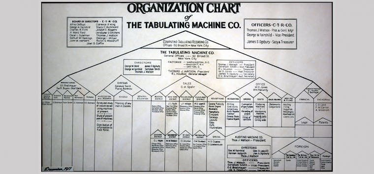
Joost wrote earlier about the shocking resemblance between organization charts today and those from more than a century ago:
"The organization chart depicted below originates from IBM and was drawn up in 1917. That's exactly a century ago! While major things have changed in the world since then, this antiquated organization chart is identical to most of the organizations we work in today. It symbolizes the outdated command-and-control model that was designed more than a century ago. It was designed for a world that no longer exists; a stable, slow-moving, predictable world."

The traditional organization chart is rigid, unrealistic and nothing more than an overview of the good old fashioned hierarchy—a pyramid composed of puffed-up job titles and empty job descriptions.
Companies that still use the traditional organization chart do so mostly because they believe there's no better alternative.
Luckily, that's not true at all.
Reinventing the org chart
Organizations these days—especially more progressive ones—are in dire need of a different solution. A solution that more accurately describes the vastly complex network of roles and responsibilities. A solution that allows one to visualize the dynamic, ever-changing nature of a group of people working together.
Guess what? These solutions are already here.
Several tools have actually popped up in recent years. Glassfrog is well-known because it's the 'default' option for organizations adopting Holacracy as an organizational model. Less Holacracy-centered alternatives to Glassfrog are Holaspirit and Maptio.
Here at Corporate Rebels, we've started using another option called Peerdom. It provides similar functionalities as the ones mentioned above but is less dogmatic about a specific approach (and, as you know, we are not fans of dogma). You can easily tweak the tool to fit your unique way of working, as it supports whatever organizational model you may have.
Peerdom, like many of the other tools, does much more than simply visualize your organization chart in a better way. By activating apps in the App Store you open up a world of possibilities.
Allow us to explain. Here's what it does for us.
1. Clarifying roles & responsibilities
Since we're a self-managed team, it's important to create transparency around who's responsible for what. We split our work up into roles. People pick up roles and take full responsibility for the performance of that role. And because our work (as almost everyone else's) is dynamic, the roles regularly change or move from one person to another.
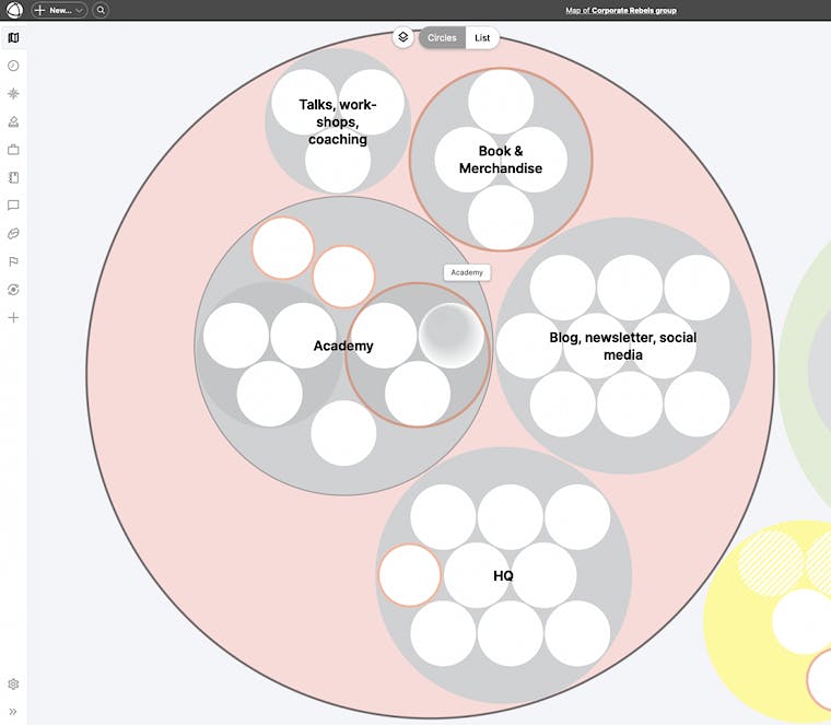
Peerdom helps us to create a dynamic map of who's responsible for which area of our company. In the screenshot below, you'll see what it looks like on the most generic level (which includes three companies: Corporate Rebels, Corporate Rebels Foundation, and Krisos, our latest venture).

The white circles represent roles, the grey circles represent teams, and the colored circles represent companies. If you zoom in to 'Corporate Rebels', this is what you'll see:

It's a great way to follow your interests by picking up the roles you'd like to fulfill. For example, some of my roles are:
- Blogger
- Strategy lead
- Book publisher
- Academy upgrader
- Way of working lead
If any of those roles are underperforming (which is very easy to spot), I'm responsible for that. The team will hold me accountable.
2. Tracking strategic goals
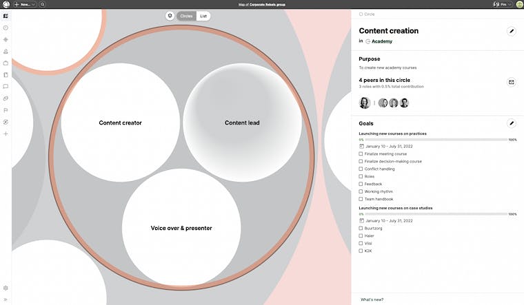
Peerdom also helps us to keep track of our strategic goals. Every six months we set our strategic goals. We'll enter them into Peerdom and attach them to the roles that are responsible for it. This helps us to easily track our progress.
Below, you'll see what it looks like.

3. Giving and receiving feedback
Another feature that we use is the option of giving and receiving feedback. You can invite team members to give you feedback on specific roles. This allows everyone in the team to get a sense of how they're performing in their various roles (plus, how their team members are doing).

Join us to explore these transformative insights and unlock the first chapter of our book, on the house! GET YOUR FREE CHAPTER NOW!
Supporting self-management
As we take on more and more activities as a team, it's super helpful to create transparency around who's responsible for what, how everyone's progressing, and what we can improve. Plus, it allows everyone to easily pick up (and ditch) roles. This helps all of us to continuously explore which combination of roles best fits our talents and skills.
For us, such a tool is a valuable addition to make self-management easier.
But let's be clear: it's not the tool itself that will make you work progressively. That's still entirely up to you. The tool is just there to support.
Anyway, the point is that such tools are a hell of a lot better than the status quo of useless traditional organization charts. So give them a shot!
If you want to learn more about less hierarchical organizational structures, check out our 6-week course in which you'll learn all about 5 of the world's most progressive companies. For more information click here.


